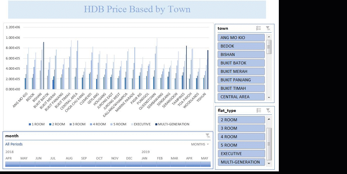
In above example, we use data queried from gov.sg and provide only screen shot for illustration purposes. To create dashboard, we will utilize excel pivot function along with Slicers and Timeline filtering options.
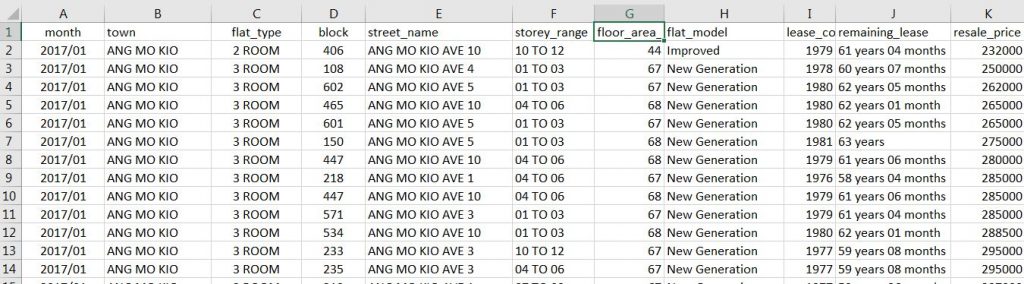
1.Preparing Data in CSV format
Prepare your raw data as shown below.
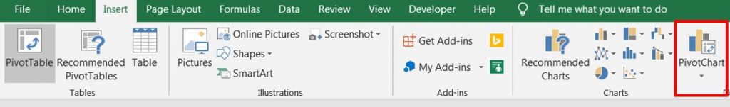
2. Create Pivot Chart
Highlight the raw data and select INSERT > PIVOT CHART.
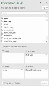
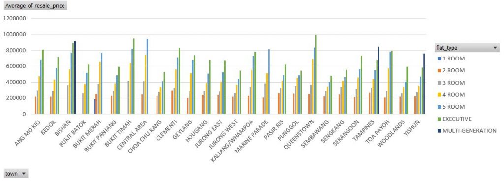
Drag the fields or column name to Columns, Rows and Values area. Change the Values to summarize by Average.
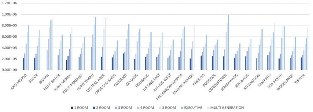
Change the chart colour, hide all pivot table button, change label layout to Bottom and change number format to scientific.
before
after
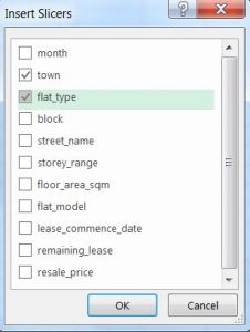
Cut the chart and paste in new sheet named Dashboard. Select the chart and click Insert > Slicers in Filters option.
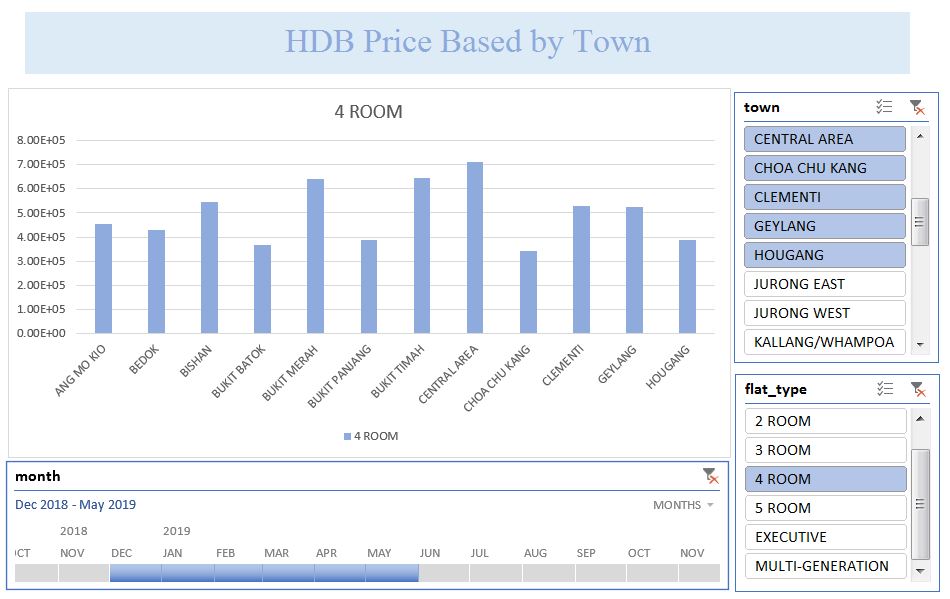
Finally, Insert Timeline for date filter. Play around to design your best dashboard for presentation. 🙂